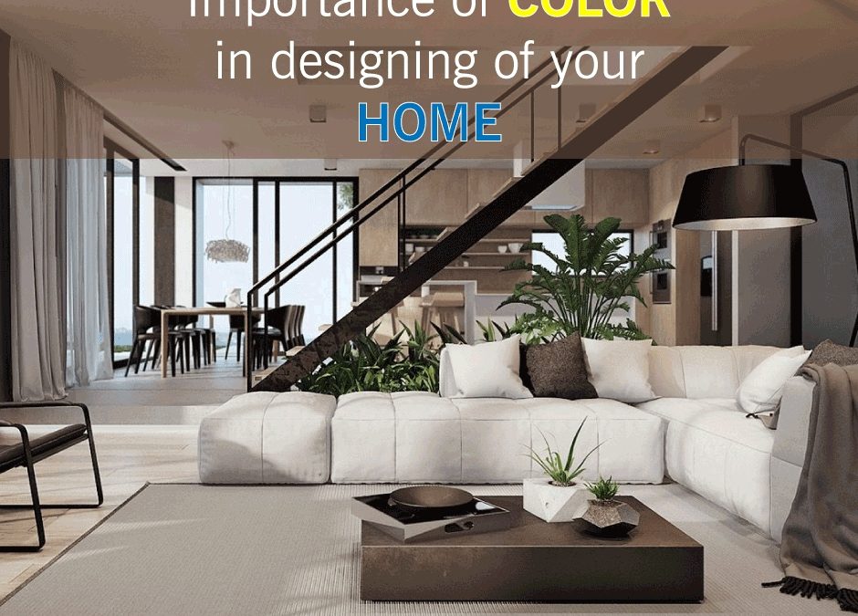
It’s not an exaggeration to categorize colors as an international visual language to transmit or communicate through interior design. There is no other way to express it better than just use of colors in designing the facilities and to do that one needs to understand the nature and significance of colors, how colors behave, their character and influence on our mood. Remember! Colors can make or break a space. Choosing an appropriate color for facilities according to space and utility is an important aspect of interior design. Though you’ve hired any designer for your home, the essential knowledge of colors is required. Remember a thumb rule, Warm tones, like red, orange and yellow can energize a space and its occupants. Cool tones such as blue, green and purple generally create quiet, relaxing atmospheres.
Along with the colors, what also effects are shades and lights. All colors change their character when lightness and saturation are adjusted or modified. Light colors are airy and make rooms feel larger and brighter while dark colors are sophisticated and warm, they make rooms feel intimate. Remember this thumb rule, Warm tones, like red, orange and yellow can energize a space and its occupants. Cool tones such as blue, green and purple generally create quiet, relaxing atmospheres.
Behavior of Color
Understanding the behavior of color is quite easy. Normally colors behave in three ways i.e. active, passive and neutral. Neutral colors are black, grey, brown and white that mostly used for maintaining the balance in the décor along with the active and passive shades. Bright colors like Green, Yellow, Red and Orange are termed as active colors as while darker colors including blue, violet, purple etc. are passive colors. Active colors are commonly associated with traits like strength, confidence, enthusiasm, and exuberance. Passive Colors: Passive colors are more neutral and toned-down than active colors. They tend to promote mental focus, and often have a calming effect.
Space can become under-stimulated if it features weak intensities of colors or monotonous color contrasts while highly saturated colors, strong contrasts and complex visual patterns can make an over-stimulated space.
Color- Space Psychology
The color that is used in interior designing and décor has a deep impact on the aura that has been created. Thus it is necessary significant to correctly assess what this ambiance should be before choosing the colors. A living room, for example, needs to be exciting and energizing while a bedroom has to be calming and relaxing.
While selector a color palette for a room, consider the following:
1. If you have pets or small children stay away from white and other colors that are difficult to care for.
2. Colors you pick should either coordinate or contrast. So decide whether you want a relaxing aura or dynamic one. Keep in mind to consider shades and tones.
3. Orange is an energetic color; Yellow is uplifting one; Blue is calming & serene; Purple is rich; dramatic and sophisticated; Green is calm and restful and Red is stimulating.
4. Understanding the psychology of colors, you can choose colors for the spaces accordingly.
Thus, according to the need of the space and your preference, choose colors wisely.